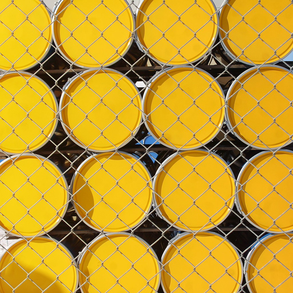
Walking through the Håga industrial area on Saturday I stopped outside Greif Sweden for a very artistic shot through the fence. The company manufactures steel drums of many different models (and colors) here. I believe this model is a 216,5 liter tight head steel drum, so now you know that! Greif Sweden are very concerned with environmental issues and are planning to heat the oven at the plant with pellets. The factory dates back to 1960 when it was known as Van Leer. Today around 30 people work here. The clever title of today's post is thanks to my flickr friend Jim.


13 comments:
Wow! Great design and composition. It is certainly "eye grabbing."
Nicely done, Steffe! I think a touch or two of blue would be nice, you know, considering they are Swedish barrels!
Jag liftade en gång från Handen med en kille som skulle till Van Leer när det byggdes. I mitt minne sa han att han var ägaren, men han var kanske nån höjdare inom företaget. Fin bil hade han i alla fall.
Fantastic!
Boy, this was just begging you to pull out your camera. They really get colorful with their barrels.
très original et belle composition, c'est pour faire un morpion géant ;)
Interesting photo. Like the yellow and the problem ecology. :)
Visit my site: http://bulgariaturism.blogspot.com/
Thank you!
Very artistic, indeed, Steffe. I like it.
Very nice! I'm glad you picked the yellow ones to photograph.
This is a pretty photo. I love the bright yellow.
It's perhaps hard to see from this angle but the barrels are actually blue. It's just the lids that are yellow, so they really are Swedish Jacob!
Van Leer är ju ett holländskt bolag, men jag vet inte om det var dom som byggde fabriken.
I am always looking for something like this: basic colors and simple geometry. The image is great, the fence a plus and the title a good idea.
I love the geometry here!
Post a Comment