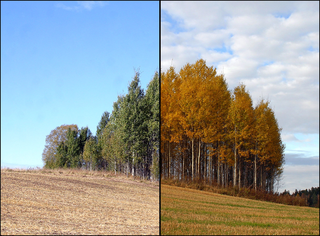
As you probably know by now, I will often go back for another photo if I find a beautiful spot, or an interesting building or anything else that I find eye-catching. This is one such place. A field in rural Österhaninge near Hesslingby. I think this diptych technique works well here. The photo I used for the left part was taken a couple of days ago. The more colorful and autumn looking photo is from 2007. It's a popular photo over at flickr with some 17 000 views. To see my other Different Seasons posts press here.


14 comments:
Very nicely done! Quite a contrast...
such fun, steffe.
Quite a fascinating contrast. I can well understand that it would have quite that many hits on Flikr.
I like also your tree that you visit all year round. I have tried to find something like that to return to in my own city but not been successful thus far.
Valdigt bra gjort, Steffe Meister! Fina farger!
Lingonsyllt forst och framst med allt! Halsningar fran Lingon Leif
Interesting photographs...
I like this a lot. Good job Steffe.
This is such a huge difference. Superb comparision! Nice looking shots, both of them...
- Pixellicious Photos
bonne idée ce montage, je prefere la version de droite
nice! very nice indeed!
I sure hope Leif is not talking smack about me, Steffe...
Cool picture!
Nice comparison shots. I like the one on the right, especially the fluffy white clouds in the sky!
Both sides are great! I've just taken a look at your blog. Great photos!
Well seen and very well done.
The diptych is an excellent idea, I understand why all these hits on the gorgeous 2007 photo.
Post a Comment